
Loop XXI Education · Bitcoin · Models
Reading a Log-Periodic Bitcoin Chart
Wavy curves wrapped around a straight Bitcoin trend line are all over X right now. They come from two different families of math that happen to share a name. This guide explains both, then walks through what a fit like this can and cannot tell you.
Education only. Nothing on this page is investment advice, a price target, or a forecast. Model curves describe past data. Lines drawn into the future are extrapolations of a fitted formula, and they can be wrong by a lot.
The chart that started this
On October 9, 2026, Matthew Mežinskis of Porkopolis Economics posted an updated Bitcoin chart on X (@1basemoney). We are not reposting his image. Open the link to see it. The numbers below are split in two. Figures read off that chart image are marked as such and dated October 9, 2026. Figures from the public page are from porkopolis.io/thechart/ as it read the same day.
The image shows Bitcoin's US dollar price from late 2020 on a log scale, with dotted lines running out to 2029. It draws a straight line labeled OLS, a wavy line labeled log-periodic, and curves labeled Q0% through Q100%. Shaded spans carry drawdown labels. The deepest label printed on the image is about 77% over 12 months.
The public page describes a different fit: the plain power trend, price = a × (days since the genesis block)b, counting days from January 3, 2009. As read on October 9, 2026, that page shows an intercept near 2.2×10⁻¹⁷ and a slope coefficient of 5.73. It says the R² of that plain relationship is above 95%. It does not print the eigenmode figures below. The slope 5.73 is a separate fit from the 5.72 in the eigenmode legend.
The legend on the October 9, 2026 image names an eigenmode fit using singular spectrum analysis (SSA) and dynamic mode decomposition (DMD). Read from that image, it prints β = 5.72, R² = 0.9936, "trend explains 96.1%", "cycle explains 3.2%", and six modes. The periods printed there run from about 0.73 years to about 7.77 years. The mode whose decay factor |μ| equals 1 has a period of about 1.45 years, which the legend calls the most persistent. The same legend prints "for every 12.9% increase in X, Y doubles." The public plain-trend page also shows the trend doubling after about 12.9% more days. That is the same kind of arithmetic on the 5.73 fit, not a second printing of the eigenmode slope.
The Q0%–Q100% curves are not defined in the image legend. On the public page, speaking about the plain power trend, Mežinskis writes that the percentile bands currently shown are a pure quantile regression: a percentage of time price has spent around levels of a power regression, not a bell-curve standard deviation. He also notes that he has at other times drawn percentiles as multiples around an OLS line. Neither the public page nor the image legend says whether the Q curves on this October 9 image are ranks of past residuals around the wavy line, or quantile curves fitted on their own. That cannot be determined from those sources. Either way, the bands record historical frequencies. They are not future probabilities.
Two ideas, one nickname
"LPPL" is used loosely on X for any chart that combines a power law with oscillations. The original LPPL model is narrower. It asks whether a particular rise has the shape of a bubble. A power law with cycles asks where price has sat relative to a fitted trend. Those are different questions. Neither one is a finding that growth will continue.
Sornette's LPPLS: a conditional estimate of a regime change
Physicist Didier Sornette, who founded the Financial Crisis Observatory at the Swiss Federal Institute of Technology in Zurich, developed the log-periodic power law singularity model with Anders Johansen and Olivier Ledoit in the late 1990s. His book Why Stock Markets Crash (2003) lays it out for a general reader. The model describes a bubble in which herding and imitation can push price up faster than exponential growth would. A fit summarizes that shape and estimates a critical time, written tc. tc is a conditional estimate of a regime change. Price does not have to diverge at tc, and it does not have to crash on that day.
ln p(t) = A + B(tc − t)m + C(tc − t)m cos(ω ln(tc − t) − φ)
A positive bubble, in this formula, means three conditions at once. Time is still before the critical time, t < tc, so the expression describes the approach and not the day itself. The exponent sits between zero and one, 0 < m < 1, so the fitted growth rate steepens as tc gets closer instead of settling into ordinary exponential growth. And B is negative, B < 0, so the power-law term lifts log price as the time remaining shrinks. If those conditions fail, the same equation is not describing that kind of bubble. Under the conditions, log price in the formula stays finite. What steepens is the growth rate.
The cosine is the "log-periodic" part. It repeats in the logarithm of the time left before tc, so the wiggles draw closer together in calendar time as t approaches tc. That is a statement about timing. It is not a statement that the swings must shrink. The output of a fit is a window in which a change of regime is more plausible if the bubble conditions hold. It does not produce a price target.
Sornette's group applied this to Bitcoin in a 2018 paper, published in 2019 by Royal Society Open Science (Wheatley, Sornette, Huber, Reppen and Gantner, arXiv:1803.05663; journal version). They found four intervals where price ran far above a network-based estimate of value, with the faster-than-exponential pattern the model expects. Their own limit matches the formula: the fit can flag a high crash hazard and a probabilistic bracket for the timing, while the exact trigger and the exact day stay unpredictable.
Some analysts on X still use short, local LPPL fits this way, to flag a possible blow-off weeks ahead. Hendrik_Z describes doing exactly that and counts five out-of-sample signals so far, which is an honest sample size.
Power law plus cycles: swings around a fitted trend
The Bitcoin power law fits price against time since the genesis block on January 3, 2009. On a chart where both axes are logarithmic, that fit is a straight line. Giovanni Santostasi popularized the idea, and Porkopolis has published a version since 2018. The slope depends on which fit you read. Stephen Perrenod's March 23, 2026 article reports an ordinary-least-squares exponent of 5.68. Porkopolis's public plain trend, as read on October 9, 2026, shows 5.73. The eigenmode legend on that day's chart image shows 5.72. A power-law formula has no critical time. Drawing the line past the last data point assumes the fitted shape continues. That assumption can be wrong, and the slope itself does not show that growth will continue.
ln price = a + β · ln(days since genesis)
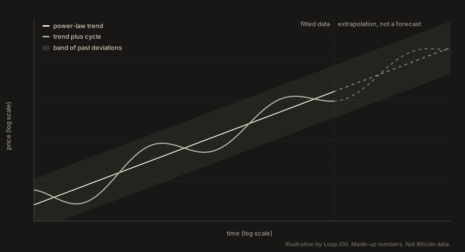
Price spends long stretches well above and below that line, so people add cycles on top. Two constructions get called log-periodic. They do not share a clock, and neither one means the trend will keep rising.
- Log-age cycles. The oscillation is periodic in the logarithm of Bitcoin's age, of the form cos(ω ln t + φ). Because the repeat is in log age, the calendar gap between waves grows as Bitcoin gets older. Perrenod's March 23, 2026 article reports a spacing λ of 2.01: a major wave tends to arrive when age is multiplied by about 2.01. λ is a timing parameter. It does not say the swings get smaller. His September 24 post and this research note thread sit in the same family.
- Fixed-calendar SSA/DMD modes. SSA and DMD come from signal processing. SSA slides a window along the log-price series and splits it into layers ranked by how much variation each explains. DMD then prints a period, amplitude, phase, and decay factor for each oscillating layer. Santostasi described this approach in a March 2026 thread. The Porkopolis eigenmode fit is in this family. The formula printed on the October 9, 2026 chart image uses a cosine of 2π x / T, so each mode repeats on a fixed period T. The legend's periods are in years. The factor |μ|x in that same formula is amplitude decay, a different number from T. One printed |μ| is 1, so that mode's amplitude does not fade in the printed fit. The others sit just below 1. A fixed period and a decay factor are not the same fact, and neither one means growth will continue.
| Sornette LPPLS | Power law plus cycles | |
|---|---|---|
| What it describes | A possible bubble, and only while the conditions hold | Past swings around a fitted power-law trend |
| Trend | Faster than exponential only if t < tc, 0 < m < 1, and B < 0. tc estimates a regime change. Price need not diverge or crash on that day. | A power law in age, with no critical time in the formula. Extending the line assumes the fit continues. |
| Oscillations | Periodic in the log of time remaining, so calendar spacing shrinks as t approaches tc. That is timing, not amplitude. | Log-age cycles: calendar spacing grows with age. Fixed-calendar SSA/DMD modes: period T is fixed, and |μ| is a separate amplitude factor. |
| Typical output | A hazard window under those conditions, not a price target | A fitted curve and a place among historical bands |
What the fit numbers do and do not mean
High in-sample fit alone does not establish predictive skill. The R² of 0.9936 is read from the October 9, 2026 chart image. The formula on that image is for ln y, so this R² is on log price, not on the dollar price.
The same legend says the trend explains 96.1% and the cycles explain 3.2%. Both shares use total variation in log price as the denominator. The cycles' 3.2 is 3.2 points of that total, not 3.2% of the residual left after the trend. On a log-price scale, a smooth rising curve can track most of a long climb, which is why an in-sample R² this high is a weak reason to trust the wiggles. The public plain-trend page only says that its own R², the 5.73 fit, is above 95%.
The image prints 26 coefficients: the intercept, the slope, and, for each of six modes, a period, an amplitude, a phase, and a decay factor. Those printed coefficients are not necessarily independent degrees of freedom. The legend defines a harmonic as a mode at one half or one third the period of a longer cycle, so several of the six can be overtones of one motion rather than six separate causes. Besides those coefficients, the analyst picks the SSA window, printed as 2,992 samples, and keeps 12 SVD modes. If the samples are daily, 2,992 of them span about 8.2 years. The longest printed period, 7.77 years, is close to that window. A specification with that many settings can trace a lot of past wiggles. Tracing them is not the same as having found the cause.
Other dated fits pin the cycles differently, and they do not share a variance denominator with this image. Perrenod's March 23, 2026 article centers on log-age spacing of 2.01, and he reports that two log-periodic modes explain about 74% of the residual variance around his own power-law trend. That 74% is a share of the leftover, not the 3.2 points of total log-price variation printed on the Porkopolis image. Santostasi's March 2026 thread describes another SSA and DMD decomposition. The spread does not mean anyone did sloppy work. It means the cycle part is still loosely pinned down.
Mežinskis says as much himself. In a September reply he noted that the log-periodic line drifts and reacts more to new data than the plain power-law fit does.
Fit is not forecast
The dotted lines on the right side of the October 9, 2026 image run a printed formula forward. They show where that formula goes if the periods, amplitudes, phases, and slope stay as printed. That is an assumption about the formula. It is not evidence that growth will continue.
The Q bands need a prior question, answered above: the image does not say whether those curves are residual ranks or fitted quantile curves, and the public page's quantile-regression note is about the plain power trend. If the bands are residual ranks, they say how today's residual compares with past residuals of the same fit. If they are fitted quantile curves, they are separate in-sample curves, one per percentile. Either reading describes historical frequencies. Projecting the bands forward does not turn those frequencies into future probabilities.
Two replies on X make the point well. One reader under the October 9 post (@Manu08514934) warned that log-periodic models are easy to fit in-sample and weak out of sample, and suggested walk-forward tests: fit only on data up to a past date, predict the next stretch, then step forward and repeat. Cory Klippsten (@CorySwan) raised a subtler problem. If the model was chosen because it already fit data through 2026, re-running it from 2014 does not make the later years a clean test, because those years shaped the choice of model.
A short checklist for any cycle chart
- What data was the curve fitted on, and when was the method chosen?
- Is there a walk-forward test, and how did predictions made at past dates turn out?
- How many numbers were fitted, and how many full cycles does the data contain for the longest one?
- When the model is refit with new data, how far do the past curve and the projected curve move?
- Are the bands residual ranks around one fitted curve, or quantile curves fitted on their own? If the chart does not say, treat that as unknown. Either way, the bands describe historical frequencies, not future probabilities.
- Is the model an LPPLS bubble model, which estimates a regime change only while t < tc, 0 < m < 1, and B < 0, or a trend-plus-cycle description of past swings? Extending either formula does not show that growth will continue. The two constructions answer different questions.
These charts are useful for one thing: they show where price sits against its own history under one set of assumptions. Read them that way and they can sharpen your questions. Read them as a schedule and they will eventually let you down.
Sources
- Porkopolis Economics, The chart, read October 9, 2026, for the plain power trend (slope 5.73 and the quantile-regression note). Eigenmode figures in this article that are not on that page are read from the chart image dated October 9, 2026. Matthew Mežinskis's October 9, 2026 post, September 29 post and September 22 reply. Chart and model are his. This page does not rehost the image.
- Wheatley, Sornette, Huber, Reppen and Gantner, "Are Bitcoin bubbles predictable?", arXiv:1803.05663 (2018), and the Royal Society Open Science version (2019).
- Didier Sornette, Why Stock Markets Crash: Critical Events in Complex Financial Systems, Princeton University Press, 2003.
- Stephen Perrenod, "Bitcoin's Scaling Law: Power Laws, Log Periodicity, and a Hidden Coupling", March 23, 2026, and his September 24 post; summary thread by @btc_powerlaw.
- Giovanni Santostasi, SSA and DMD thread, March 2026.
- Critiques: @Manu08514934 on walk-forward testing, @CorySwan on model choice and out-of-sample claims, and @Hendrik__Z on local LPPL signals.
Loop XXI wrote this summary in its own words. Credit for each model belongs to the researchers named above, and any errors in describing their work are ours.
Education material. Loop XXI provides products and education, not financial, legal, or tax advice. Nothing here is a recommendation to buy, sell, or hold any asset, and no model on this page is a price prediction.