

Scarcity under pressure
Six bond, debt and Bitcoin charts, tested against the latest inflation, growth and funding evidence.
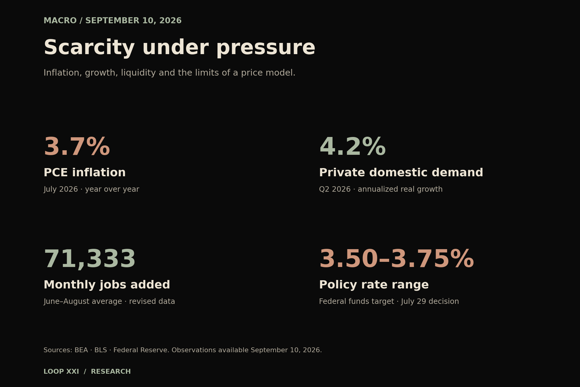
Company update — September 10, 2026
Loop XXI now focuses on macroeconomics and Bitcoin education. AI building and product development are paused. The product-building discussion later in this article reflects an earlier company direction. This note was added after publication; the original publication date and block height are retained.
A question about purchasing power
A government bond can promise dollars and still disappoint its owner. A scarce asset can have a fixed supply and still fall sharply. Both can be true because a promise, purchasing power and a market price measure different things.
Six widely shared charts bring that distinction into focus: global bonds measured against commodities, a century of long Treasury returns, federal debt across administrations, equities divided by the Federal Reserve balance sheet, and two Bitcoin price models. Together they raise a useful question: how should we judge financial claims when the cost of real things, the cost of funding and the supply of money keep changing?
Our reading is that September's evidence describes an uneven expansion with persistent inflation and sensitive funding markets. It strengthens the case for examining purchasing power and cash flow carefully. It does not establish an inevitable bond collapse, a guaranteed policy rescue or a scheduled Bitcoin price path. The observations below were checked on September 10, 2026. Official releases refer to their stated periods; none is a live reading of the entire economy.
What the bond charts establish
The chart shared by Marty Bent shows the Pring World Bond Index divided by a CRB commodity index at 0.55 on September 8. The ratio has fallen substantially from its 2020 high. That is a statement about the relative performance of those two series. It is not a measure of household inflation, every bondholder's total return or the precise amount of wealth destroyed. Index composition, currency exposure, coupons and the choice of starting date matter. We have inspected the chart, but have not independently reconstructed its proprietary index history. [1]
Greg Rieben's repost of a BofA chart labels the ten-year annualized return on US Treasuries with maturities above fifteen years at roughly minus 2% in August 2026. This is a particular long-duration segment and rolling window. It should not be read as the return on Treasury bills, all government debt or the annual return of every investor. The original research dataset was not available for independent reconstruction. [2]
The economic mechanism is well established: a fixed bond's price generally declines when market yields rise, and longer maturities are usually more sensitive. Receiving the promised nominal amount at maturity also leaves the purchasing power of that amount uncertain. Higher starting yields can improve prospective income even after a terrible historical period. A backward-looking chart alone cannot settle which effect will dominate next. [3]
Inflation has cooled unevenly
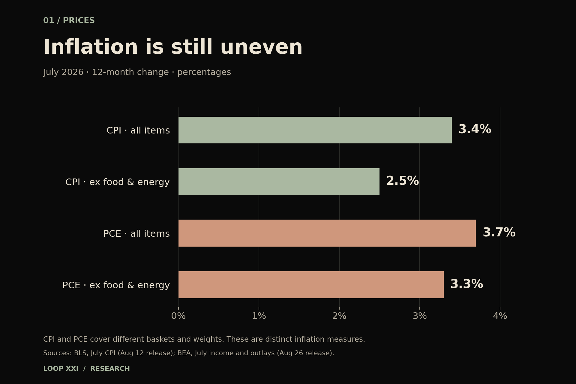
July CPI rose 3.4% from a year earlier; CPI excluding food and energy rose 2.5%. Energy prices were 14.7% above their year-earlier level even though they fell 1.5% during July. A falling monthly energy price and a high annual inflation rate therefore coexist without contradiction. [4]
The separate PCE measure rose 3.7% over the year, or 3.3% excluding food and energy. Both headline and core PCE increased 0.2% during July. CPI and PCE use different coverage and weights, so their readings should not be treated as interchangeable versions of one number. [5]
On July 29, the Fed maintained its target range at 3.50–3.75%. Three dissenters preferred a quarter-point increase. The statement described inflation as elevated and identified supply shocks, including energy, as a contributor. This was a hold with visible concern about inflation. It was not an announced easing cycle. [6]
Our interpretation: the bond/commodity ratio fits a world in which the price of physical inputs can outrun fixed nominal promises. But weaker energy prices in a later period, sustained disinflation or slower demand could change the balance. A strong structural argument still needs a dated economic test.
Growth has more than one speed
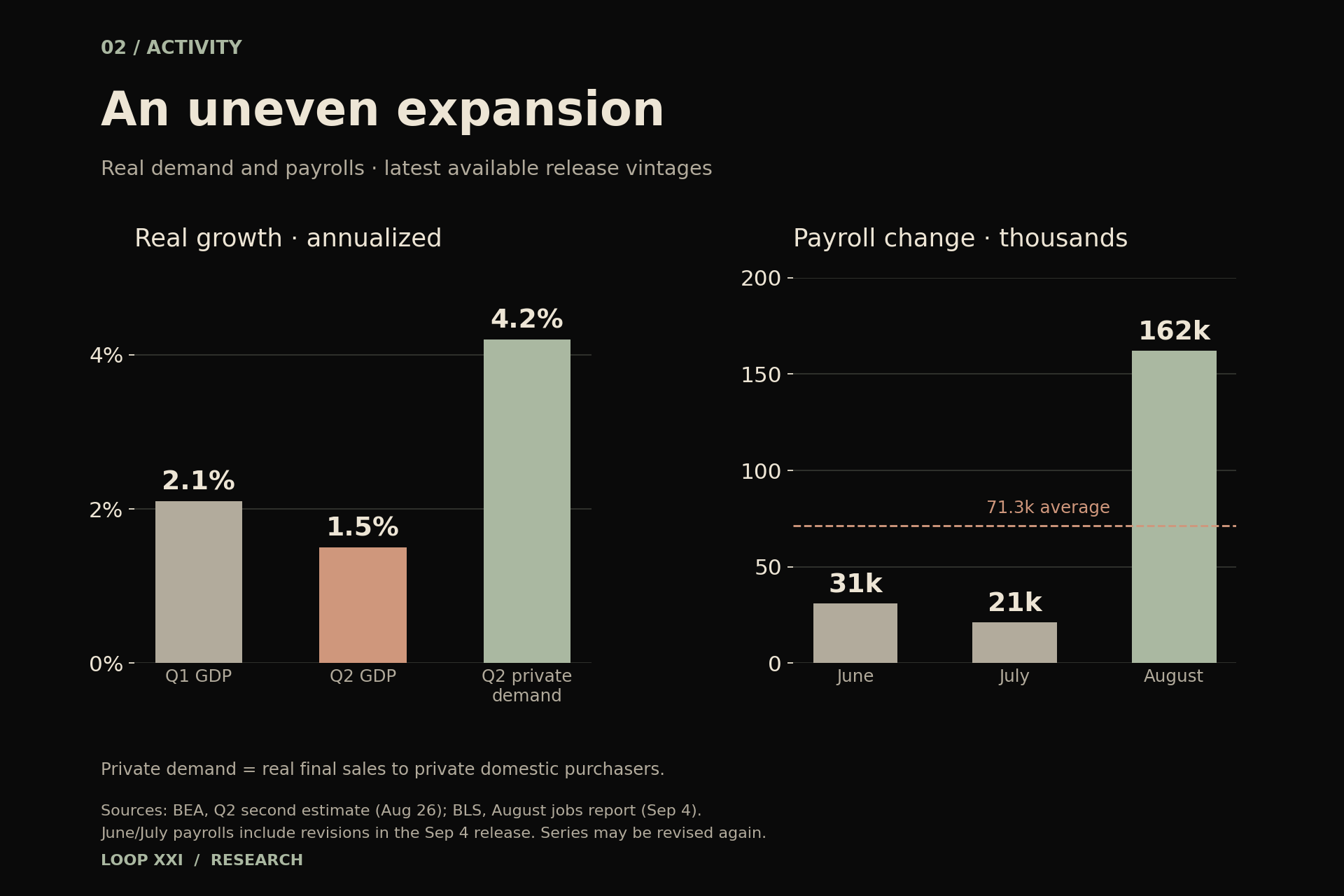
Real GDP grew at a 1.5% annualized rate in the second quarter, down from 2.1% in the first. Yet real final sales to private domestic purchasers—consumer spending plus private fixed investment—grew 4.2%. Trade, inventories and government can move headline GDP differently from private demand; the two figures answer different questions. Annualized rates also are not the same as the actual quarter-to-quarter percentage change. [7]
August payrolls increased by 162,000 and unemployment was 4.1%. After revisions, June added 31,000 jobs and July added 21,000. That produces an average of about 71,333 jobs a month across the three months. The average puts August's improvement in context without erasing it. Payrolls measure jobs; the unemployment rate comes from a separate household survey. [8]
For businesses, this is a reason to measure their own demand carefully. A healthy aggregate spending figure does not guarantee a full order book in every sector. A soft headline does not prove every customer has stopped spending. Actual inquiries, repeat use, delivery time and collected cash provide information that a national average cannot.
Debt is a financing problem before it is a slogan
River's chart shows federal debt rising under successive administrations, using an explicit fiscal-year attribution convention. It is useful as a picture of persistence. It cannot, by itself, allocate responsibility among Congress, inherited budgets, tax receipts, recessions, emergency spending and interest costs. Percentage increases also depend on the starting debt stock and length of the period. [9]
Treasury distinguishes debt held by the public from intragovernmental holdings; total public debt outstanding includes both. A gross debt chart and a market financing analysis consequently need different denominators. For financing pressure, the useful questions include the maturity of debt being refinanced, the rate on new borrowing, interest costs relative to receipts and who is absorbing issuance. [10]
Inflation can reduce the real burden of an existing fixed nominal obligation. It can also raise future borrowing costs, living costs and political pressure. There is no accounting identity that converts a rising debt line into an automatic gain for every scarce asset. The direction of policy and the path of market demand remain open questions.
Follow liquidity through the balance sheet
The S&P 500/Fed balance-sheet chart shared by Roberto Rios ends on April 23, 2024, despite being posted in August 2026. That date matters. Dividing an equity index by central-bank assets can make a useful comparison, but the resulting ratio is neither an inflation-adjusted total return nor proof that asset purchases caused every market move. It also leaves out earnings, dividends and changes in private credit. [11]
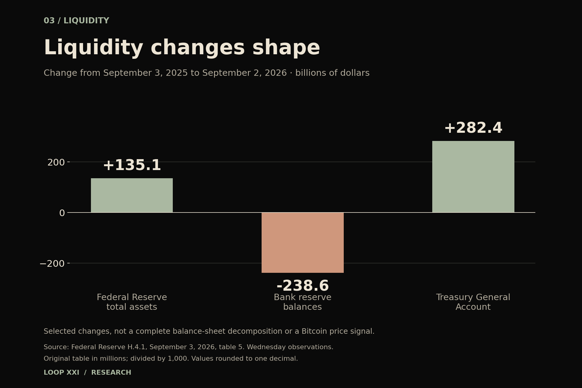
More recent official evidence illustrates the problem with reading one balance-sheet line in isolation. On September 2, Fed assets were about $6.737 trillion, bank reserve balances $2.929 trillion and the Treasury General Account $944.4 billion. Compared with September 3, 2025, Fed assets had increased $135.1 billion while reserve balances had fallen $238.6 billion and Treasury's account had risen $282.4 billion. These are Wednesday snapshots, not weekly averages. The selected changes are not a complete decomposition. [12]
Federal Reserve researchers' August note explains why Treasury issuance, dealer financing and money-market funds' allocation choices can affect repo funding. Their analysis finds that the distribution and use of liquidity matter alongside its aggregate quantity. A dollar of additional Fed assets is not a dollar automatically committed to buying Bitcoin. [13]
Our interpretation: watch reserve conditions together with Treasury cash movements and the price of secured funding. A popular liquidity overlay may describe part of the environment. It cannot replace the plumbing or establish a stable trading lag on its own.
Bitcoin scarcity and Bitcoin forecasts
The SatoshisQuest screenshot extends a fitted log-periodicity model to December 31, 2031. Its hover box shows about $1.13 million for the modeled oscillating curve and $613,400 for the trend. Those are outputs of a model, not future market observations. A displayed one-sigma band does not establish a reliable probability range without validated assumptions about errors and stability. [14]
The Fidelity chart reposted by Rand Group is explicitly dated August 9, 2026. Its power-law support line and BTC/gold divergence indicators provide a way to frame a hypothesis. The word support does not create a bid, a redemption promise or a price floor. The lines can be crossed. Historical labels in that image are not today's quote. [15]
Bitcoin's protocol supply schedule is different in kind from those statistical fits. The existing rules limit issuance toward 21 million coins; they do not fix the amount of goods, services or dollars that a coin will buy. Demand, leverage, custody arrangements and the willingness of marginal holders to sell still influence the market price. Scarcity is a property of the asset, not a guarantee about the path of its valuation. [16]
Our standard for a useful model is demanding: specify the data and parameters, test predictions made before the outcome was known, compare simpler alternatives and record failures. A line fitted across the past is a starting point for inquiry. It is insufficient evidence for a promised return.
What would change our view
One possible path is broader disinflation with continued real demand. Repeated improvement in inflation, healthy private spending and orderly funding would weaken the argument for an imminent macro rupture. It could help longer-duration assets without requiring any fixed Bitcoin outcome.
A second path is persistent supply pressure and sticky inflation. Renewed energy increases, firmer underlying inflation or tighter policy would keep pressure on financing and purchasing power. Scarce inputs might benefit in relative terms while some asset owners still suffer losses from leverage or a high entry price.
A third path is a funding squeeze or demand contraction. Deteriorating employment across several releases, wider credit spreads and strained repo markets would require closer attention. Assets people ultimately want to own can be sold to meet immediate cash needs. A long-run monetary thesis does not remove that short-run constraint.
These are conditional scenarios, not assigned probabilities or trade recommendations. Upcoming releases can overturn today's interpretation. The next CPI report is scheduled for September 11; BEA's next income and GDP releases are scheduled for September 30. We will judge the new observations against the argument, rather than forcing them into the existing picture. [4, 5, 7]
The practical implication: earn the scarce asset
For Loop XXI, the business response is to build useful work that customers can verify and pay for: reliable delivery, functioning integrations and evidence that a problem was solved. AI can make producing code or commentary easier. The harder work is earning trust, gaining permissioned access to real workflows and carrying responsibility for an outcome.
That is a hypothesis to test through use and payment, not a claim that a defensible advantage already exists. Company progress must be measured after the cost of delivering the service. A payment received, cash settled, Bitcoin acquired and Bitcoin available after obligations are distinct events.
The charts make a serious case for thinking in purchasing power. The business still has to earn its place in that future, one useful delivery at a time.
Sources and chart method
The six social charts are attributed through their original public posts. They are discussion sources, not independently audited datasets. This article does not reproduce their third-party artwork. The cover and three charts are original Loop XXI graphics drawn from the official releases cited below; their dates, units and transformations are stated in the captions. The H.4.1 current-release link changes over time; this article uses the September 3, 2026 release as observed September 10.
Educational macroeconomic commentary by Loop XXI. No customer outcomes, company Bitcoin holdings or investment returns are claimed.
Sources
- [1] Marty Bent — bond/commodity chart, September 10 (data September 8) ↗
- [2] Greg Rieben — reposted BofA long Treasury return chart, September 4 ↗
- [3] SEC Investor Bulletin — bond prices and interest-rate risk ↗
- [4] BLS — July 2026 CPI, released August 12 ↗
- [5] BEA — July 2026 income and outlays, released August 26 ↗
- [6] Federal Reserve — July 29, 2026 FOMC statement ↗
- [7] BEA — Q2 2026 GDP second estimate, released August 26 ↗
- [8] BLS — August 2026 employment, released September 4 ↗
- [9] River — federal debt growth chart, August 17 ↗
- [10] U.S. Treasury — Debt to the Penny definitions and data ↗
- [11] Roberto Rios — S&P 500/Fed balance-sheet chart, posted August 17; chart ends April 2024 ↗
- [12] Federal Reserve — H.4.1; September 3 release inspected September 10, table 5 ↗
- [13] Federal Reserve researchers — repo markets and the balance sheet, August 26, 2026 ↗
- [14] SatoshisQuest — Bitcoin log-periodicity model, September 3 ↗
- [15] Rand Group — reposted Fidelity Bitcoin chart, August 17; data August 9 ↗
- [16] Bitcoin.org — supply, value and volatility FAQ ↗
Educational commentary from Loop XXI. Publication record: Block 966,361.
If this was useful, you can send a tip.