
The house ran. The paycheck walked.
Real new-home prices nearly doubled since 1971 while real median family income rose about a third. A median new mortgage now costs about 64 hours of production-worker wages a month, up from 39. Here is what the data shows, and what it does not.
Two lines
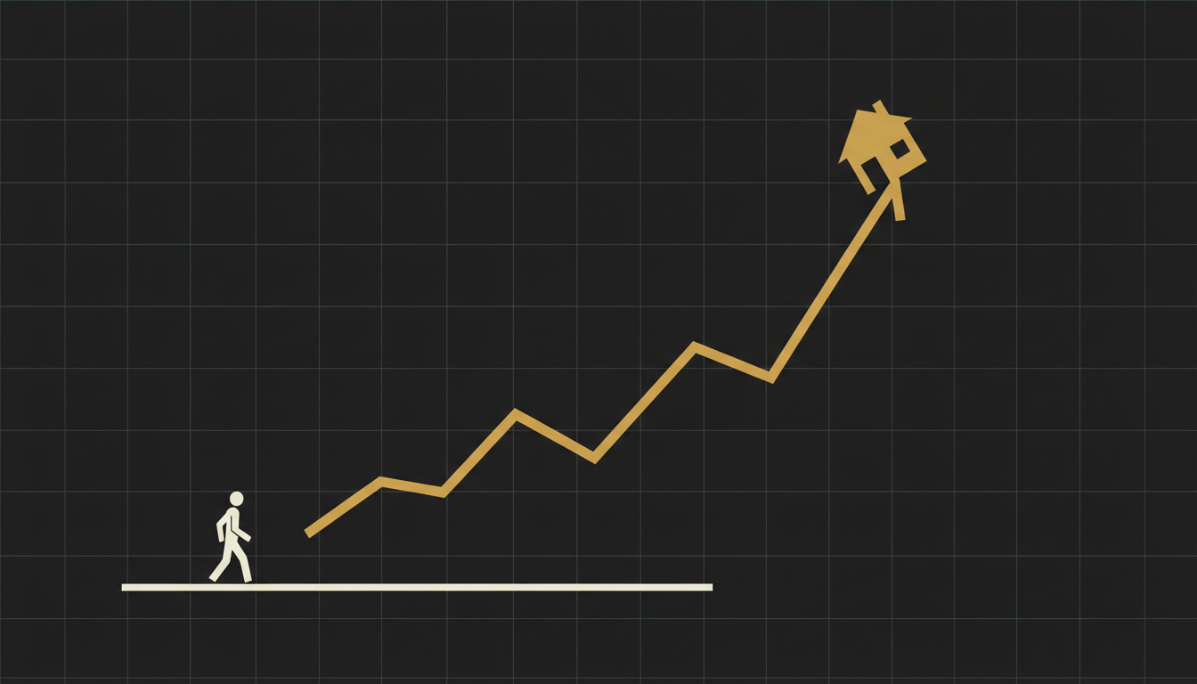
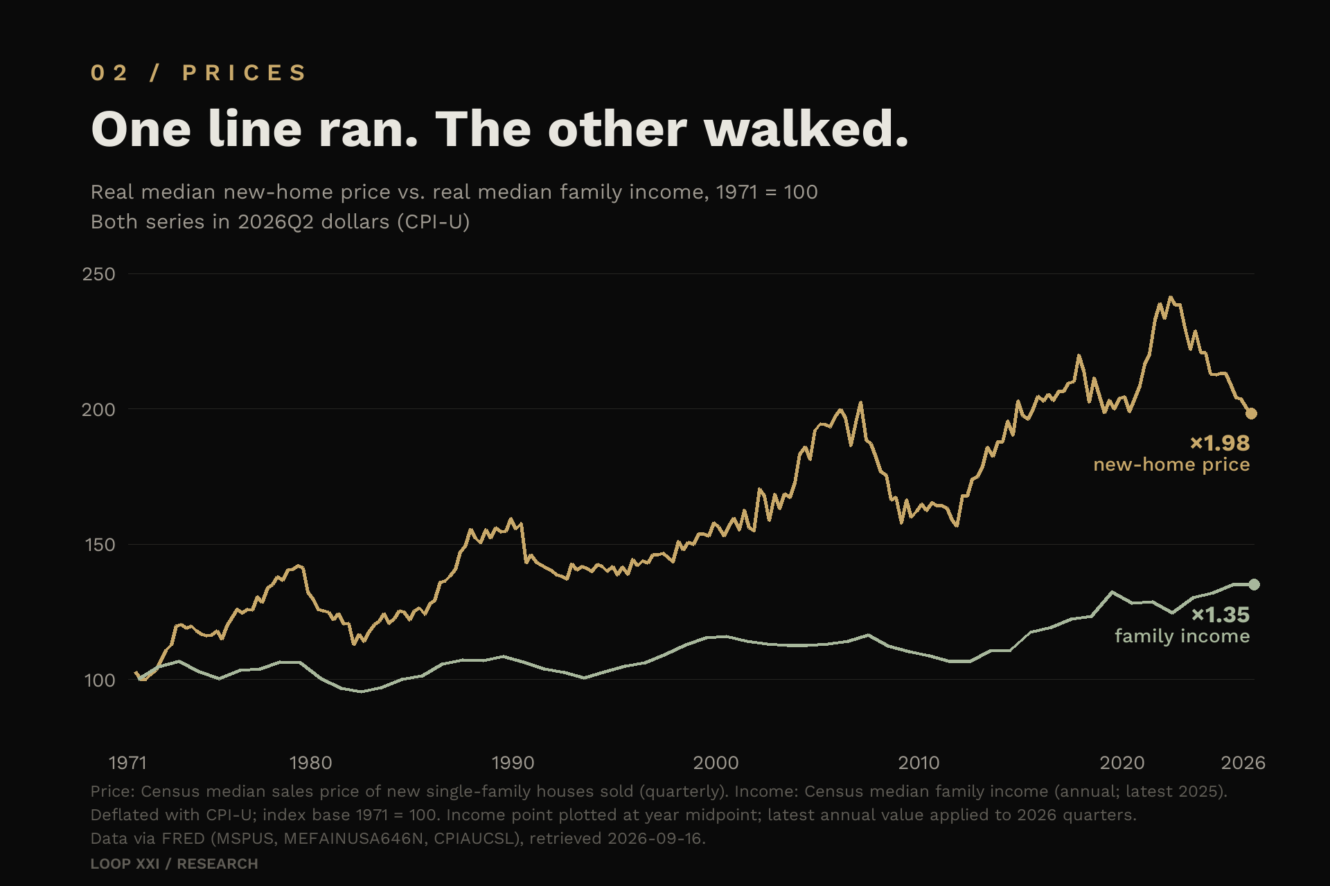
Between the fourth quarter of 1971 and the second quarter of 2026, the inflation-adjusted median price of a new American house rose 98.3 percent. Over the same period, real median family income rose 35.0 percent. One number is a price. The other is a paycheck. Drawn on the same chart, one line runs and the other walks, and the widening space between them is the housing story of the past half century.
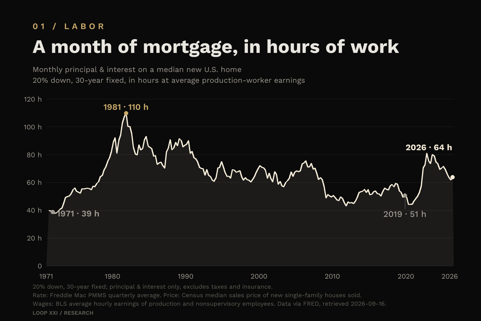
Dollars are one way to see it. Hours are another, and for most households hours are the unit that actually gets spent. In late 1971, the principal and interest on a median new home, financed with 20 percent down and a 30-year fixed mortgage at that quarter's average rate, cost about 39 hours of production-worker wages per month. By mid 2026, the same calculation costs about 64 hours. The down payment grew from roughly 1,377 hours of work to roughly 2,543. In 1971, assembling a 20 percent down payment took about half a year of median family income. Now it takes about three quarters of a year.
What we measured, and what we did not
The price series is the Census Bureau's median sales price of new single-family houses sold, quarterly, deflated with CPI-U. The income series is the Census median family income, annual, deflated the same way. The comparison starts in 1971 because the quarterly mortgage-rate series that drives the payment calculation begins that year. From 1984 onward we can also use median household income, and we do, but we never mix the two. A family and a household are different units, and swapping them between decades quietly breaks the comparison.
The payment calculation holds the loan contract constant: 20 percent down, 30 years, fixed, principal and interest only, at the Freddie Mac average mortgage rate for that quarter. It excludes property taxes, insurance, and fees. Holding terms constant is the point. It isolates what actually changed, which is prices, rates, and wages. The wage denominator is the BLS average hourly earnings of production and nonsupervisory employees, the closest thing in the data to an ordinary paycheck.
The median new home is also not the only market. Existing homes, measured by the Case-Shiller national index and deflated the same way, are up 75.5 percent in real terms since 1987. Different series, same direction.
Fifty-five years, in hours
The ratio of the median new home price to median family income went from 2.48 in late 1971 to 3.72 in mid 2026. The same kind of house absorbs roughly half again as much of a year's income as it did for the generation that bought in 1971.
In hours, the monthly payment went from about 39 to about 64, from roughly one standard work week to one and a half weeks. The down payment went from 1,377 hours to 2,543. These are national aggregates, and they compress five and a half decades that were anything but a straight line. But the endpoints are the endpoints.
Where the story gets more complicated
Any argument about affordability has to survive its counterexamples, and there are real ones. Take a household that bought in late 1984. Real prices were up 62.5 percent by mid 2026 while real median household income rose 25.9 percent, so by the price-to-income measure the house got more expensive. But that household's payment burden went down, from 39.6 percent of monthly income to 28.2 percent, because the average mortgage rate fell from 13.65 percent to 6.41 percent. For that buyer, the problem was never the price tag. It was the financing.
The early 1980s deserve remembering. In late 1981, with an average mortgage rate of 17.74 percent, the payment on a median new home consumed about 44.8 percent of median family income. Today's 22.4 percent is far below that. Measured purely by the monthly payment, the 1980s buyer had it worse than the 2020s buyer.
So the claim that every generation had it strictly harder than the last one fails. The durable erosion is in the entry price and in price relative to income, not in the monthly payment across every era. The defensible version of the argument is narrower and more interesting: at comparable stages of life, the assets that build a household balance sheet cost more hours of work than they did for earlier cohorts, and the entry payment takes longer to assemble.
The 2020s shock was a financing event
Look closely at the last six and a half years, because they shaped how the current starting position feels. From late 2019 to mid 2026, real median new home prices were roughly flat, down 2.8 percent, and real median household income was roughly flat, up 1.1 percent. And yet the monthly burden on a median new home rose from 21.0 percent of income to 28.2 percent, and the payment rose from 51 hours of work per month to 64. The average mortgage rate went from 3.70 percent to 6.41 percent.
Almost none of that deterioration came from prices outrunning wages in real terms. It came from the cost of borrowing against the prices. A buyer today gives up about a third more of their income for the same real house than a buyer in 2019, and the difference is the rate. That is worth saying precisely, because the common story, that houses suddenly became more expensive in real terms, is not what the data shows. Money became more expensive, applied to a price level that was already high.
Who holds the assets
There is a second line of evidence, in the Federal Reserve's Distributional Financial Accounts. In the first quarter of 2026, households born between 1946 and 1964, the Baby Boom cohort, held 51.6 percent of household net worth. Millennials held 11.0 percent. Households under 40, by age, held 6.6 percent. In 1989, the first year of the series, households under 40 held 12.0 percent.
Some of this is lifecycle, and it should be said plainly. Older households have had decades longer to accumulate, and an older population mechanically holds a larger share of the stock. Age is not the same thing as unfairness. But lifecycle does not explain the whole picture, and it says nothing about the price at which a young household must buy in. It must buy the same assets that already sit on other balance sheets, at prices those owners were never asked to pay.
What this does not establish
This article does not claim that every member of an older generation caused the problem, or that every younger household faces the same conditions. It does not treat the median new home as identical in quality and location across 55 years, because the composition of what gets built changes. It does not treat CPI as a perfect measure of the cost of living. And it does not prove that any single policy produced the outcome; the candidate list, from land use rules to rate cycles to federal deficits, is a live debate among economists.
What it does establish is narrower and durable. Measured in the same units, with the same contract terms, the entry cost of the central asset of household wealth rose much faster than the income used to buy it, and the recent deterioration in affordability is dominated by financing costs rather than by real price appreciation.
Choosing a denominator
Every number above is a denominator choice. Dollars, inflation-adjusted dollars, hours of work, and ounces of gold tell different true stories about the same period. Sitting inside that observation is a useful habit of mind: when the unit of account is managed by institutions, and the assets people need are priced against that unit, the choice of ruler is not academic. It is most of the argument.
Bitcoin belongs in that conversation as a monetary asset with a supply schedule no committee can change. That is a design fact, not a price promise, and nothing here is investment advice. But a reader who learns to price a house in hours, and to ask what a savings unit should be, has learned to reason about the monetary system from the bottom up.
What to watch
Three numbers carry this story: the ratio of home prices to incomes, the share of income a mortgage payment consumes, and the hours of work required for a down payment. All three are published, computable, and hard to argue with. If they improve, the story changes, and we will say so.
The escalator does not need anyone's intent to keep moving. It needs only prices, rates, and wages moving at different speeds. That is why it is worth measuring, and why the measurement should be public.
Sources
- U.S. Census Bureau — Median sales price of new single-family houses sold (MSPUS, via FRED) ↗
- U.S. Census Bureau — Median family income (MEFAINUSA646N, via FRED) ↗
- U.S. Census Bureau — Median household income (MEHOINUSA646N, via FRED) ↗
- Bureau of Labor Statistics — Consumer price index, all urban consumers (CPIAUCSL, via FRED) ↗
- Freddie Mac — 30-year fixed-rate mortgage average (MORTGAGE30US, via FRED) ↗
- Bureau of Labor Statistics — Average hourly earnings of production and nonsupervisory employees (AHETPI, via FRED) ↗
- S&P Dow Jones Indices — Case-Shiller U.S. national home price index (CSUSHPINSA, via FRED) ↗
- Federal Reserve — Distributional Financial Accounts, net worth by generation and age ↗
Educational commentary from Loop XXI. The block height records Bitcoin network time at publication.